Case study · Cruise Critic, a Tripadvisor company

Roll Calls

Turning a 25-year-old forum thread into a place for everyone on the same sailing.

My role
Lead product designer and researcher. Led a design sprint.
Team
PM, lead engineer, Community team
Timeline
4 months (sprint 2024, MVP build 2026)
Tools
Figma, Paper App, Vercel, Claude

A Roll Call is a Cruise Critic tradition. People booked on the same ship and date meet before they sail. The tradition lived in a classic forum for about 25 years, and it is one of the most loved parts of the site. I led the redesign into a dedicated community product.

The problem

Finding your Roll Call took several steps:

  • Pick a forum category by cruise line.
  • Pick the ship.
  • Scan thread titles for your date.

Inside a thread, hundreds of posts covered many topics. New members could not tell what mattered. Returning members could not tell what had changed.

The data showed the same problem from two sides:

  • 82% of new users have never heard of the term Roll Calls.
  • Once a user finds a Roll Call, the bounce rate is over 90%.

The constraint that shaped everything: keep what people loved — real people and real moderation — while making it much easier to find your sailing and catch up.

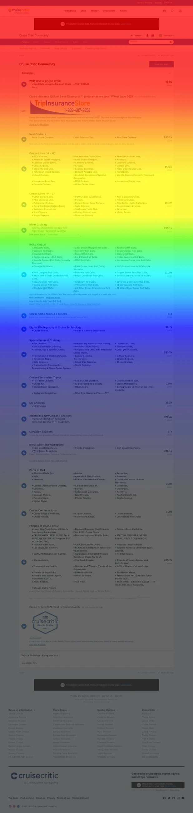
Hotjar scroll heatmap of the old desktop page, shown as a colored overlay
Scroll heatmap of the current desktop page, February 2025.

Before and after

Two recordings of the same flow, side by side. The left one shows the current experience. The right one shows the updated version.

Current experience
Updated experience

This prototype was built from Figma screens in Claude. It was populated and usable in under 10 minutes.

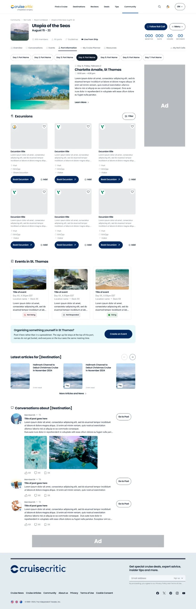
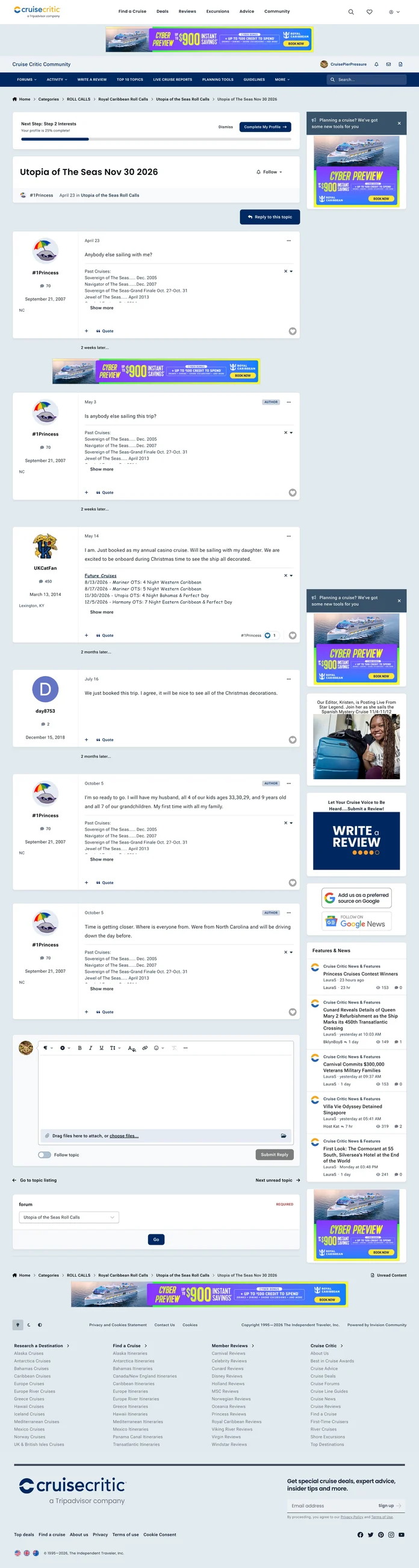
Still image of the current Roll Calls experience
Current experience, still.
Still image of the updated Roll Calls experience
Updated experience, still.

Key decisions

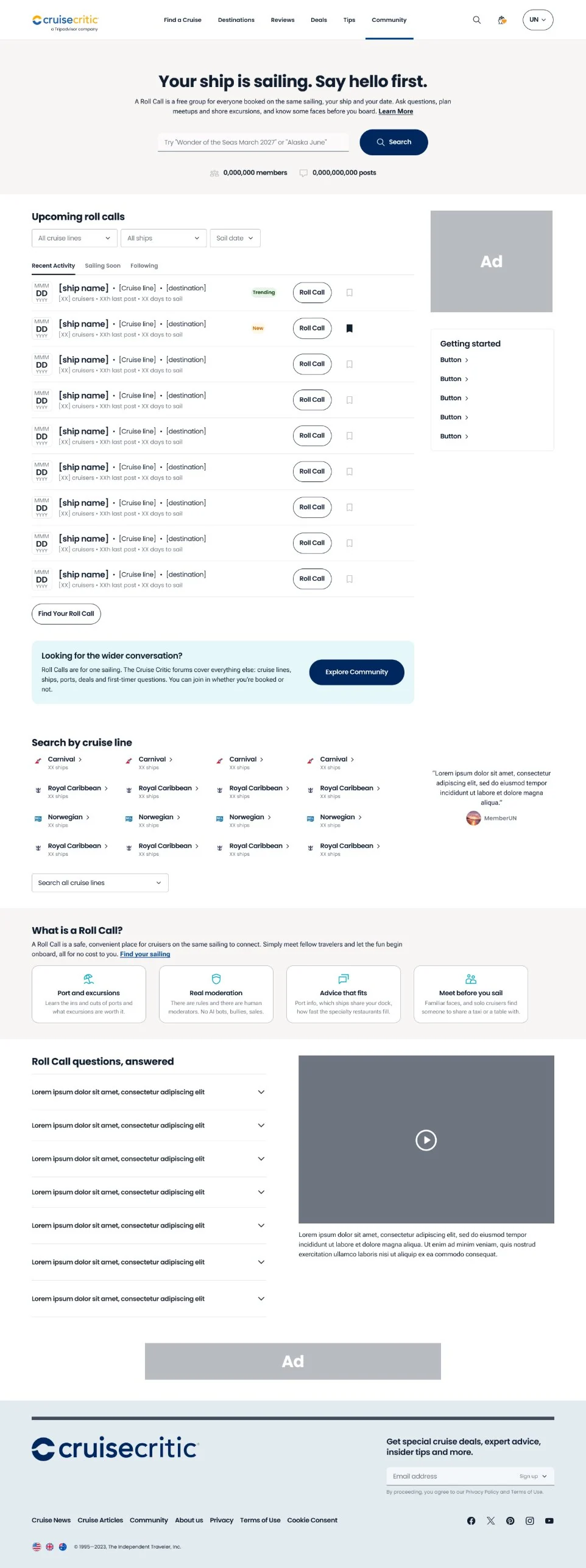
Find your sailing in three fields

Decision A finder that needs only cruise line, ship, and date.

Options Keep forum browsing as the main path.

Why Three picks beat three levels of forum navigation. Browsing stays as a secondary path, and signed-in members see the Roll Calls they follow with new-activity badges.

A page per sailing

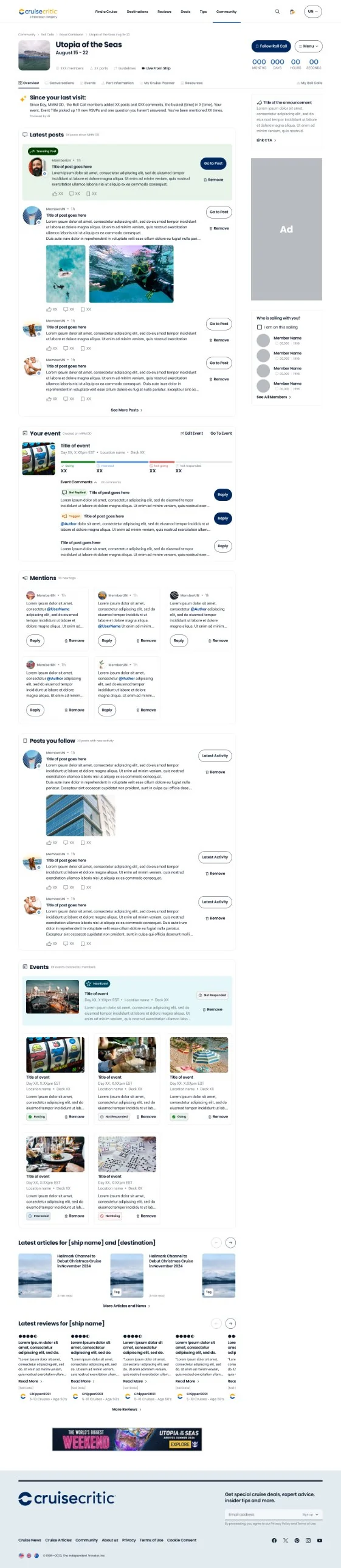
Decision Each sailing gets its own page: ship hero, countdown, Follow action, and tabs for Conversations, Events, Port Info, My Cruise Planner, Ship Info, and Files.

Options One long thread per sailing.

Why A page gives each sailing its own information architecture. A “Since your last visit” recap lists new posts, events, and mentions, so returning members catch up without scrolling a thread.

Conversations instead of threads

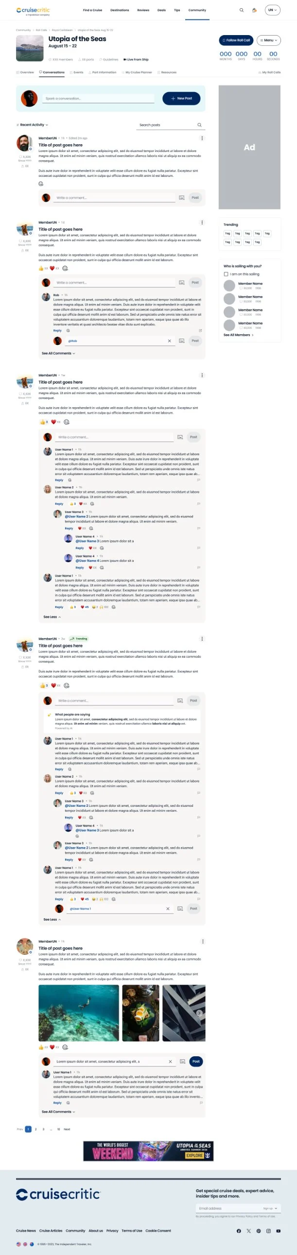
Decision A feed with a composer at the top, sort controls, tag filters, inline search, reactions, and nested replies.

Options Modernize the thread UI but keep it one linear thread.

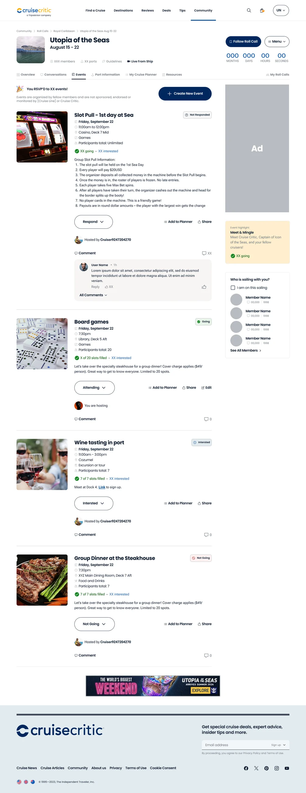
Why Hundreds of mixed-topic posts buried what mattered. A feed lets people filter by what they care about, like a port name. Member events get Going, Interested, and Not going responses.

AI with guardrails

Decision Long posts get an AI summary of what people are saying. A “What's new” tour introduces the redesign to long-time members.

Options No AI, or AI-first.

Why Summaries cut catch-up time without replacing the real people and real moderation the community loves. The tour respects 25 years of habit.
Roll Calls overview page for a signed-in member, with the latest posts and event recap
Overview tab, signed in.

The final screens

Roll Calls events tab with event cards and RSVP status
Events tab.
Roll Calls community hub with search and sailing lists
Community hub.
Roll Calls port information tab with excursions and port events
Port information tab.
Detail strip from the Roll Calls port information tab
Port information, detail.

Profiles and account

  • A member profile concept shows an AI member summary, rank and points, and upcoming sailings.
  • The profile links to the member's Roll Call and planner, and shows top boards.
  • Account settings use a left-rail layout, and hold saved favorites and cruiser preferences.

Process

  • March 2024: a design sprint with mobile explorations, an affinity map of community pain points, and paper sketches.
  • Three rounds of iteration.
  • A Ready for Dev handoff.
  • MVP build in 2026.

Designed for desktop and mobile. Signed-out and signed-in states were considered from the start.

What testers said

I ran a usability study with dscout on desktop and on mobile. Five people took the desktop study and six took the mobile study. The groups are small, so I read these results as direction, not proof.

Overall experience, 1 to 7 (7 = very satisfied)

Desktop, 5 testers4.8
Mobile, 6 testers4.5
Bar length is scaled to 7.

Average scores, 1 to 7

Features meet my needs, desktop4.6
Features meet my needs, mobile4.5
Easy to use, desktop4.6
Easy to use, mobile4.2
Clean and visually appealing, desktop4.2
Clean and visually appealing, mobile4.3
Bar length is scaled to 7. Mobile scores for ease of use were the lowest, with answers spread across the scale.

Very confident this is where to find my sailing group

Desktop, 1 of 520%
Mobile, 2 of 633%
Bar length is scaled to 100%. Two desktop and two mobile testers were not confident at all.

Facebook groups got the most picks, with 5 on desktop and 5 on mobile. Reddit came next, with 2 picks on desktop and 4 on mobile. These were multi-select answers, so testers could pick more than one.

Results

  • Roll Calls moved from a forum thread to a product with its own information architecture.
  • The MVP is in build, with engagement metrics to follow launch.
“This analysis is really very helpful! Many of the problems we are trying to solve were identified here — great validation that we are on the right path.”
Jennifer Kuhn, Product Manager — on the community research, #cc-community-migration-2026