A pharmacy app for late adopters
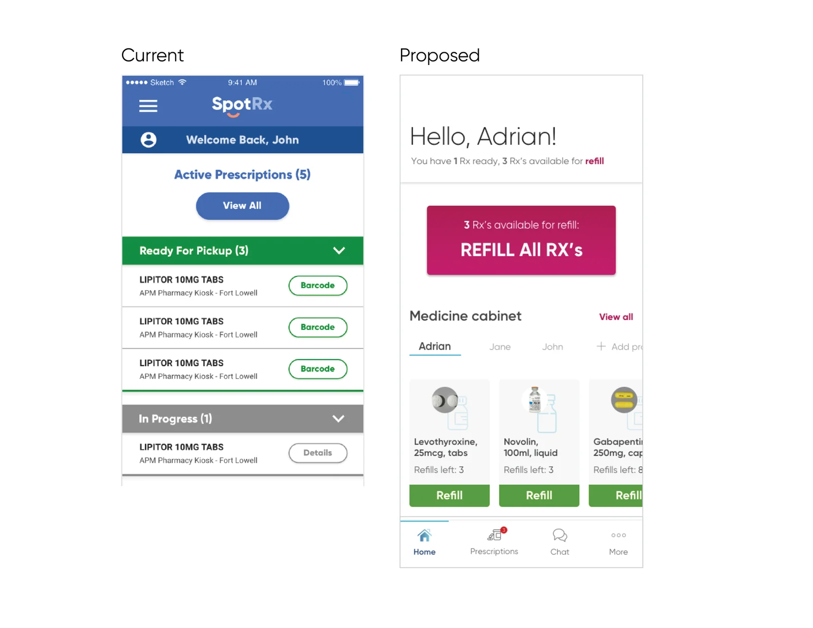
SpotRx was moving from early adopters to older patients. I led the research, the UX audit, the redesign, and the new brand test. Refills went from 9 clicks to 3.
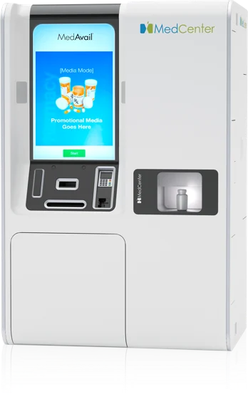
SpotRx needed its pharmacy app to work for a new group of patients: older, and less used to high-tech tools. The app had new friction points for them, engagement and conversion were weak, and a new brand arrived at the same time. I also helped link the app to a prescription pickup kiosk.
The problem
- SpotRx was moving from early adopters to an older customer base.
- The app had new friction points for these patients.
- Engagement and conversion were weak.
- A new brand arrived at the same time.
Business goals
- Reduce churn and increase revenue.
- Reduce delivery costs and drive kiosk utilization.
- Reduce pharmacy phone calls.
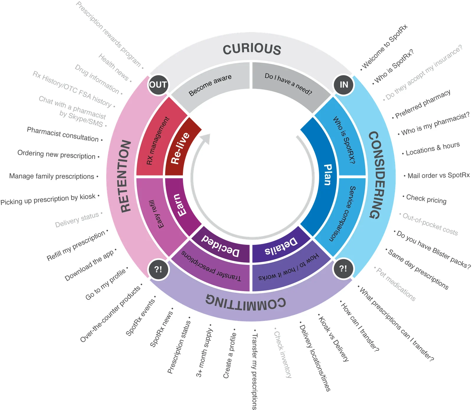
My scope
- Analytics review and usability testing.
- Stakeholder presentations.
- Wireframing, UI design, and prototyping.
- Developer handoff.
- Marketing rebrand work.
Approach
- Research. Learn why this audience used a pharmacy app and what tasks they needed to finish.
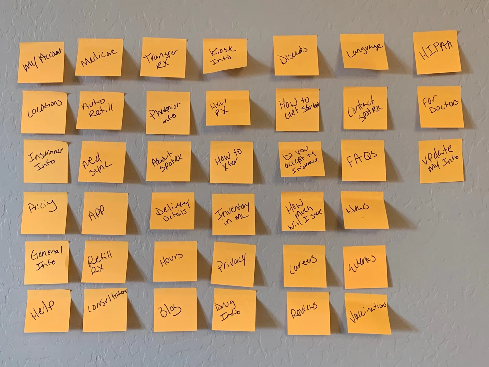
- Audit. Find the friction in the existing app.
- Redesign. Build new flows and screens.
- Test. Test the new flows and the new branding with users.
- Hand off. Work with developers to ship the design.
Results
9 → 3
clicks to refill a prescription
App + kiosk
one connected pickup experience
New brand
tested with the audience it had to win
Clicks to refill a prescription
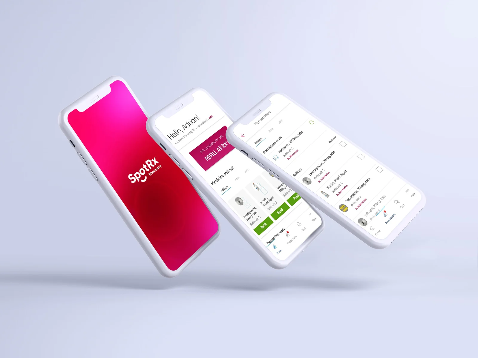
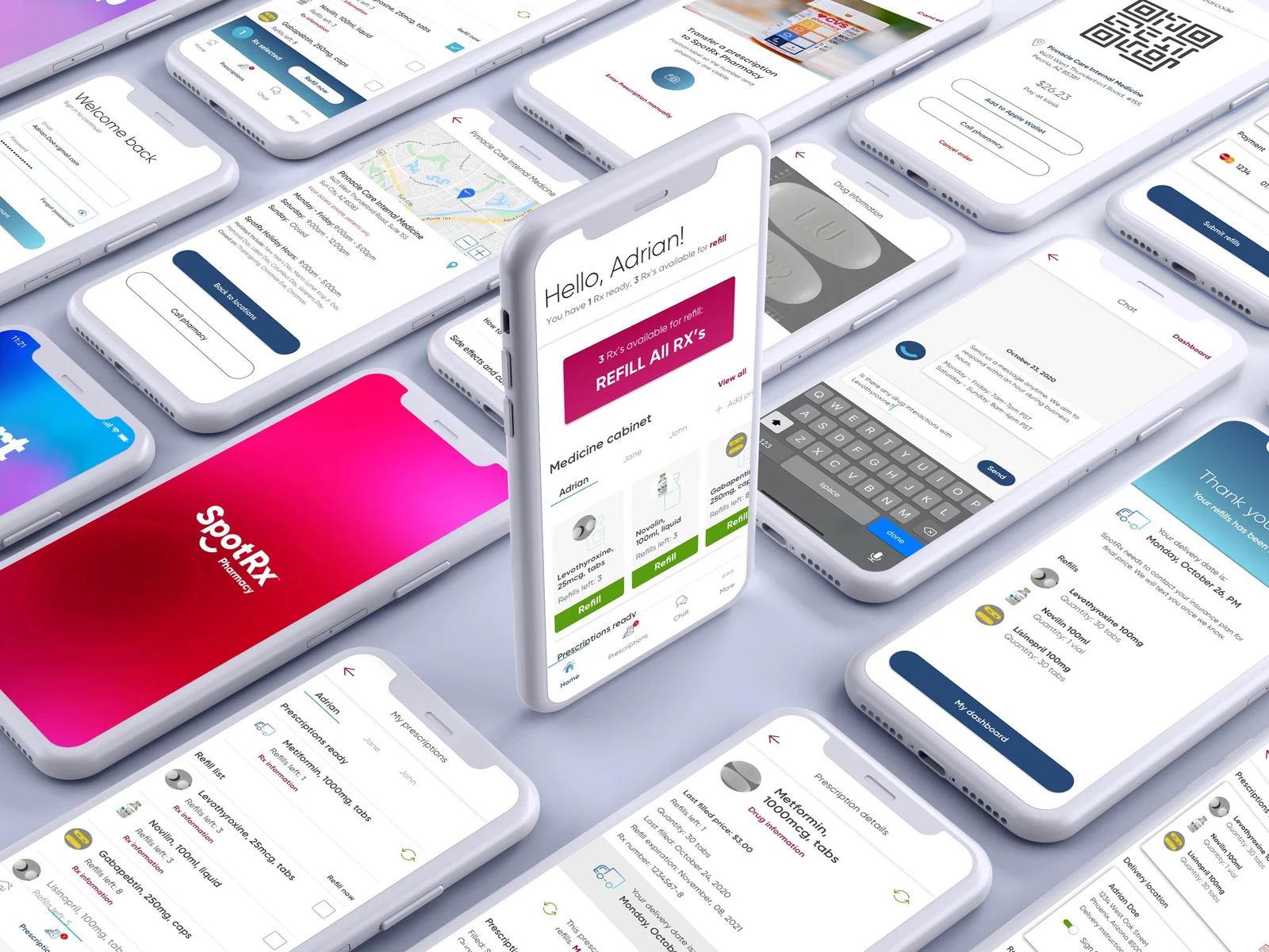
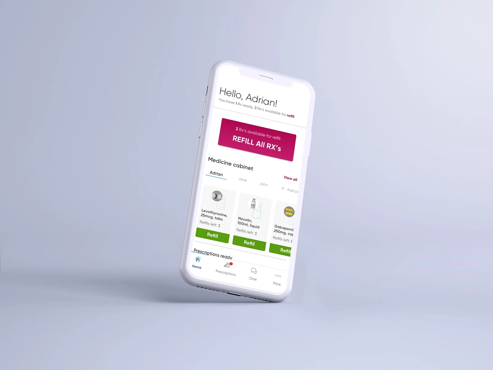
The app in context
Reflection
I am most proud of building my UX research skills on this project, and of the refill change. Cutting 9 clicks to 3 is the kind of fix every user feels on day one.